My Ratings:
Production Design (wardrobe/hair+makeup & set design & milieu) = 10
Performances/Direction = 5.5
The film is Practical Magic (1998) and stars Hollywood heavy weights Nicole Kidman and Sandra Bullock as sister witches under the care of two eccentric aunts (Dianne Wiest and Stockard Channing). It is based on the book by Alice Hoffman.
Where this movie fails in plot, it makes up for in spectacular production/art design. When I first saw this movie a decade ago, I fell head-over-heels in love with the magnificent Victorian house featured in it. The production designer in charge of the overall look for this film was Robin Standefer, who has since branched away from designing for films and opened up her own firm (Roman and Williams) with her partner Stephen Alesch here in Manhattan.
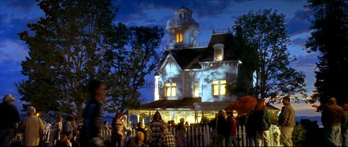
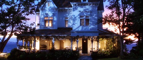
According to the production notes, this house does not exist in real life. It was constructed entirely from the ground up on a small plot of land on Washington's San Juan Island for the purposes of this movie. It basically served as an gorgeous but empty shell and was quickly torn down after the production wrapped.
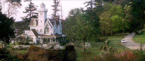
This below image is not a screencap. It's a production still but it gives you another perspective of the house that is not shown in the movie. Seriously, this is my dream house.

The movie starts off with Sally (Bullock) and Gilly (Kidman) as young girls who were sent to live with their Aunts after their parents died. A curse runs in their family which causes the female descendants to continuously lose the men they love (generally through freak accidents). When their father died, their mother "died of a broken heart" so Sally and Gilly were orphaned.
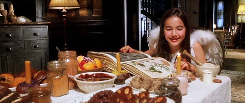
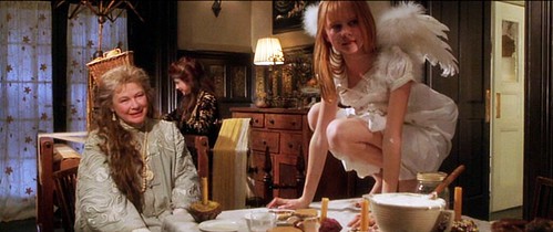
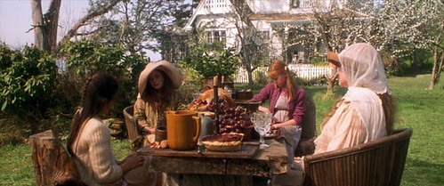
However, living with their kooky aunts actually looks really fun. They get to have chocolate cake for breakfast, learn how to do spells, and have frequent feasts out on the lawn.
Such beautiful, warm autumnal colors.
the "chairs" the girls are sitting on were carved from tree trunks
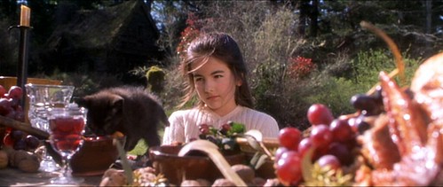
notice the little black kitten on the table!
white lace gloves on a breezy summer's day
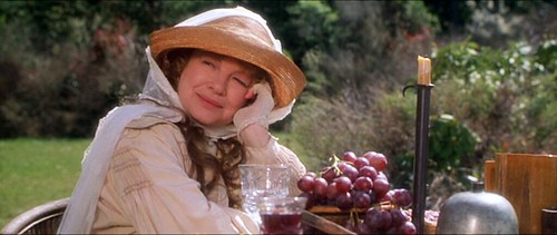
love her gigantic floppy hat and the green tunic goes so well with her red hair
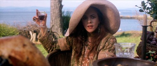
The interior of the house is traditionally Victorian, but surprisingly not entirely dark and stuffy. While the entry contains dark wood paneling and ornate moldings and the parlor is furnished with leather chairs, the rest of the house is actually quite bright and airy, especially the kitchen which you'll see later.
What a clever seating nook nestled at the foot of the stairs.
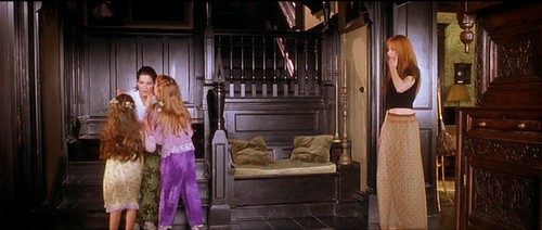
The dining room contains a large spinning wheel and spools of wool and yarn for weaving.
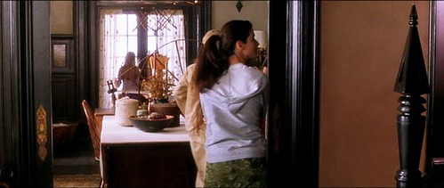
Again, the dining room. I love the row of rectangular panels with the botanical inlay (part of the wainscoting).
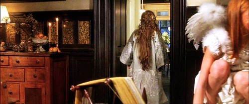
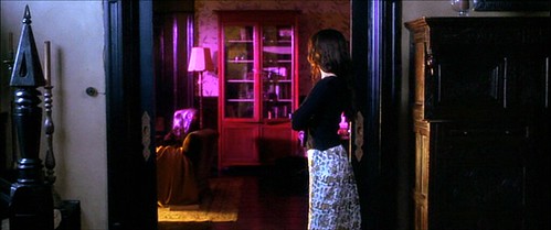
This is Sally, standing in the entryway, looking into the parlor. Love the newel post at the end of the handrail.
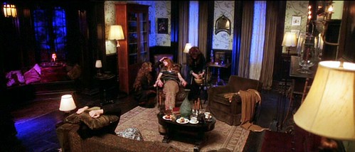
This is the parlor. The walls are adorned with botanical print wallpaper and anchored with dark wood wainscoting.
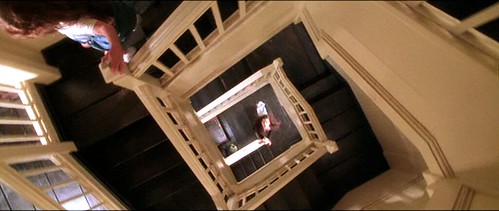
The dizzying staircase that winds up from the first floor all the way up to the attic. I am not loving the dark wood & white rail combination for some reason...I'm not entirely sure why yet.
This is the attic. The stairs then lead up the the "watch tower."
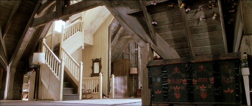
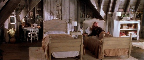
The attic contains extra beds. It looks rustic and cozy. Lots of dried flowers and herbs decorate the room.
And now we come to my favorite part of the house: the kitchen. This space is amazing and it has now permanently imprinted itself as my fantasy kitchen. Designer Robin Standefer currently has a similar, although more modern and streamlined, version of this in her own New York loft, which you can see HERE.
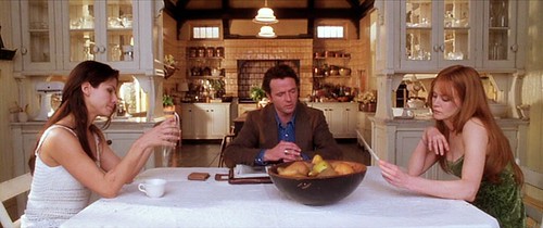
Unlike traditional Victorian kitchens, this one has a more modern flair. The cabinetry is painted in a creamy white color and even more openness is achieved with see-through glass panels.
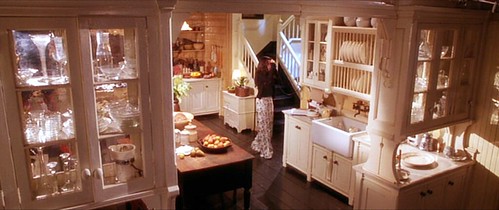
A close-up of the cabinetry. Dish rack on the counter suggests they don't have a dishwasher.
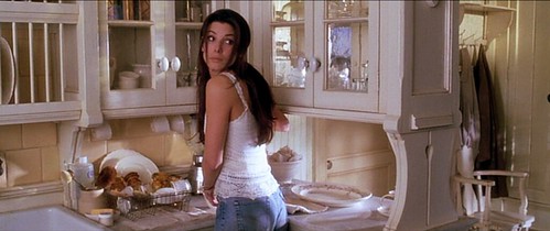
An old vintage corded phone hangs in the corner. No modern 6-set wireless in this house!
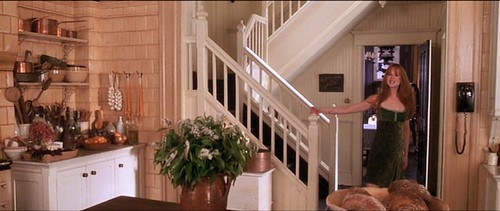
Beige tiles flank one wall of the kitchen. There is also lots of open shelving. A large wooden island is stationed in the middle.
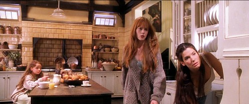
Those pears looks so delicious....they were probably fake. :::sigh:::
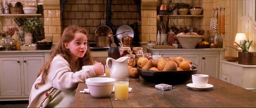
The large island is big enough to laid an entire person. Just your typical night in this witchy household. Rain and thunderstorms. Trying to raise the dead. La-dee-dah.
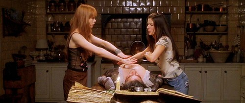
More spellcasting. Now with the help of friends! Love all the plants and bell jars on the table.
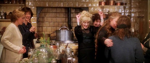
I'd love to find out what model the stove is because the piping tells me it can't be modern. It has to be some sort of fantastic antique cast-iron piece but there wasn't a good shot of it.
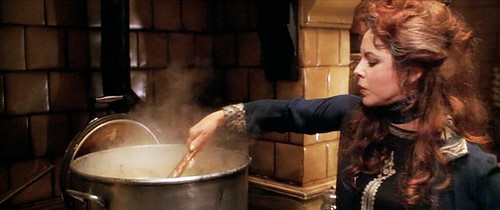
Here is a better look at the stove area. Love all the copper pots & pans and the various dried herbs.
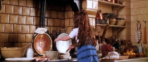
The kitchen expands into a breakfast area, which overlooks the garden.
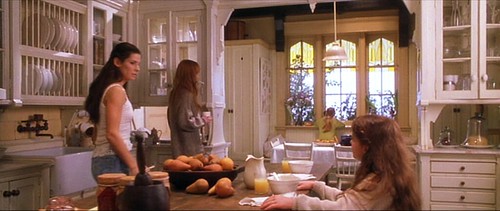
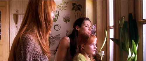
Here they are, peering out of that window in the breakfast room. Also, more botanical patterns.
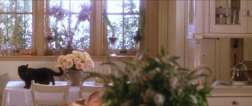
Same breakfast area. Lovely light pink roses on the table. Very soft, feminine color scheme they have going here in the kitchen.
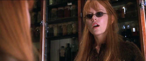
There is also a huge butler's pantry which houses hundreds of bottles of herbs. Instead of cream, they opted for a more traditional cherry finish on the cabinets.
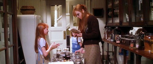
A closer view of the herbs. Cabinet doors are glass instead of wood to enable more efficient ingredient locating.
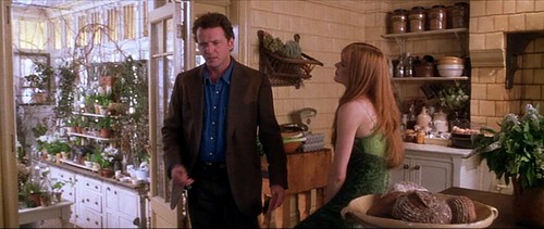
The kitchen also opens up to a beautiful conservatory.
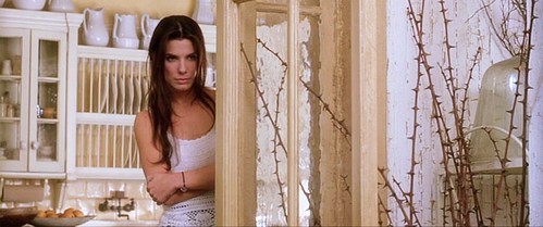
Here is Sally peering into the conservatory from the kitchen.
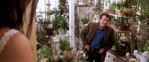
Having the conservatory attached to the house is actually a very convenient feature because you wouldn't have to brave the cold during the winter to check on your seedlings. It also makes it easier to run from the stove while you're cooking to snip off some herbs to add to your pot.
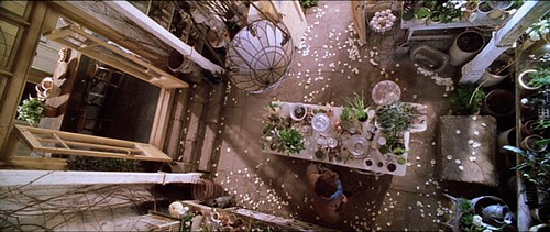
A top-down view. By the way, those are rose petals scattered all over the floor. And there is a wire basket to hold fresh hen eggs.
At night, the room seems magical, doesn't it?
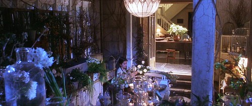
Here's a exterior shot of the conservatory at night.
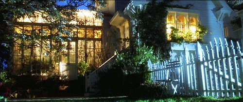
Then there is the outside of the house - the gardens and the surrounding environs. From the porch you can see that the house is situated next to the ocean.
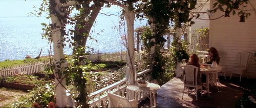
A large arbor, shady arbor for relaxing under.
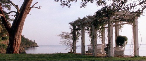
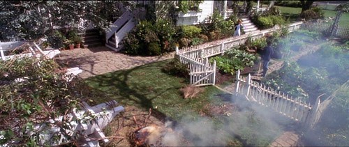
Here is a view of the vegetable garden enclosed by a white picket fence. The smoke is from a large bonfire Sally made to burn away extraneous (cut) branches.
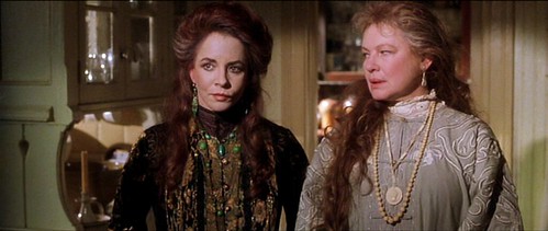
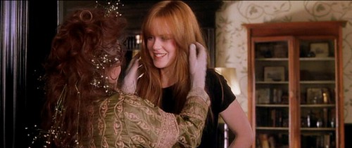
A finally, a quick look at the wardrobe pieces. While Gilly and Sally wore contemporary clothes, the Aunts seem to be stuck in a different time period. Staples for them included large hats, exquisite lace embroidered dresses, and ornate jewelry. Aunt Jet (Dianne Wiest) was generally restricted to neutral colors (lots of white and beige) while Aunt Frances (Stockard Channing) wore bright, bold colors (I liked the latter more).
Fantastic earring+necklace set on Aunt Frances (left). It looks like dark green jade? Malachite?
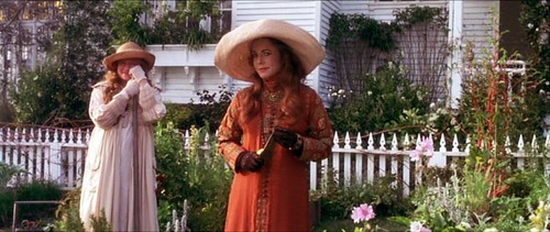
Imagine actually gardening in those heavy dresses and hats. A bit impractical to say the least.
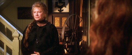
Here they are both in black. The tiny part of me that is Victorian-Goth loves these outfits.
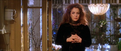
Here they are, having just returned from a festival.
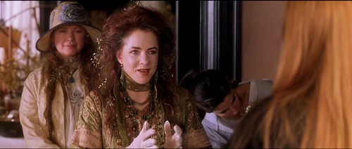
Love the little white flowers woven into Aunt Frances' hair! What are these called again? They remind me of those that you pair with roses when you're making a bouquet.
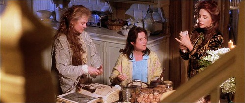
All four of the women in the kitchen, after a night of drunken reveling. Love the Aunts' silk robes.
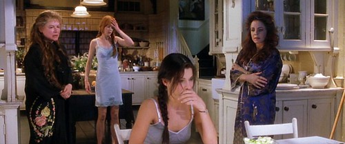
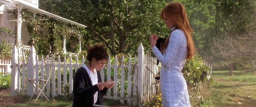
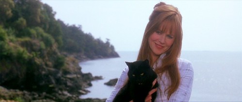
Here was one outfit the younger women wore that I was especially intrigued by - Gilly's long one-piece subtly plaid linen dress with the mandarin collar (right). Even though you can't see it well, there is a row of delicate eye-hooks that runs from the beneath the collar down to the very bottom hem so in a sense, it's also kind of like a robe but then again, it's not. I'm not sure why but I am sort of in love with this concept and I really want to reproduce it. Except you really need Nicole Kidman's long, lean body to pull off the design. :::sigh:::
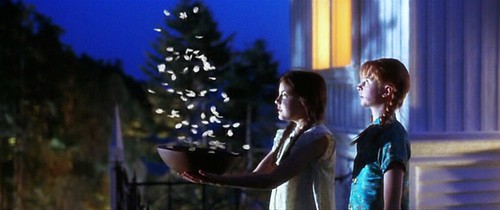
Oh, and here are Gilly & Sally when they were children. Gilly (right) is wearing a gorgeous turquoise Chinese silk qipao-like pajama set (only the top is shown here but she's wearing matching pants). I think I want to have children just so I can make them wear tiny qipao sets too.
And lastly, there is one specific prop that I'd like to touch on before I conclude this entry and that is the spellbook, or the "book of shadows" that the Aunts and the sisters use throughout the movie. It is rare that I see such exquisite detail paid to a single prop so I am beyond impressed.
Here are the Aunts, using the book to cast a love spell for a nervous client.
Here is a close-up of the book. It is opened to a different spell this time.
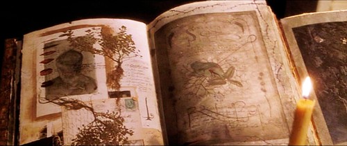
I could not find information on who was responsible for the beautiful artwork inside the book but whoever did it, did a fantastic job. Two thumbs up, art department!
A few more pages of the book:
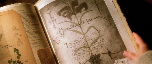
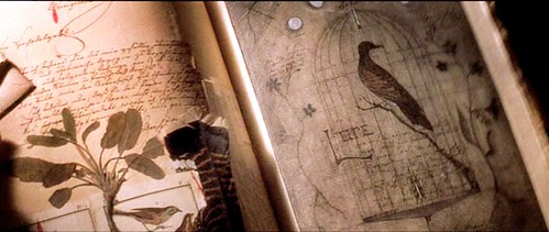
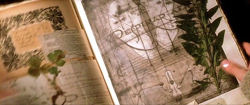
And well, that's the end, folks. (Not the movie, just this post). I'm sorry it took so long for me to get this one up. As you can see, it's pretty heavy with images so it took a while to organize and edit. The movie itself is a must-see if you like this style of the production design. The story, on the other hand, sadly crosses over to to that Hollywood wasteland of botched supernatural fluff. I, however, loved it only because I'm easily swayed by cheesy roll-your-eyes romantic comedies if there is enough great design on screen to visually enrapture me (like, You've Got Mail for example) and this movie does not disappoint!
So er... Happy Belated Halloween! Haha! Next set of movies will all be holiday/Christmas related and hopefully I'll have those up in due time!
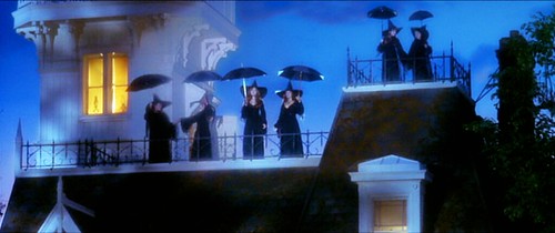
Here they all are - three generations of women - the Aunts, Gilly & Sally, and Sally's two daughters up there on the far right. They are dresses as - what else - witches for Halloween.
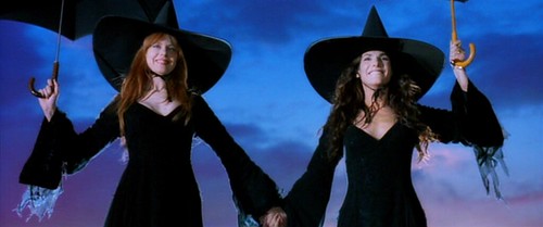
By the way, I discovered that someone actually currently owns the spellbook prop and Sally's umbrella as seen in the above image! She even has a blog!
Production Design (wardrobe/hair+makeup & set design & milieu) = 10
Performances/Direction = 5.5
The film is Practical Magic (1998) and stars Hollywood heavy weights Nicole Kidman and Sandra Bullock as sister witches under the care of two eccentric aunts (Dianne Wiest and Stockard Channing). It is based on the book by Alice Hoffman.
Where this movie fails in plot, it makes up for in spectacular production/art design. When I first saw this movie a decade ago, I fell head-over-heels in love with the magnificent Victorian house featured in it. The production designer in charge of the overall look for this film was Robin Standefer, who has since branched away from designing for films and opened up her own firm (Roman and Williams) with her partner Stephen Alesch here in Manhattan.


According to the production notes, this house does not exist in real life. It was constructed entirely from the ground up on a small plot of land on Washington's San Juan Island for the purposes of this movie. It basically served as an gorgeous but empty shell and was quickly torn down after the production wrapped.

This below image is not a screencap. It's a production still but it gives you another perspective of the house that is not shown in the movie. Seriously, this is my dream house.

The movie starts off with Sally (Bullock) and Gilly (Kidman) as young girls who were sent to live with their Aunts after their parents died. A curse runs in their family which causes the female descendants to continuously lose the men they love (generally through freak accidents). When their father died, their mother "died of a broken heart" so Sally and Gilly were orphaned.
However, living with their kooky aunts actually looks really fun. They get to have chocolate cake for breakfast, learn how to do spells, and have frequent feasts out on the lawn.
Such beautiful, warm autumnal colors.


the "chairs" the girls are sitting on were carved from tree trunks

notice the little black kitten on the table!

white lace gloves on a breezy summer's day

love her gigantic floppy hat and the green tunic goes so well with her red hair

The interior of the house is traditionally Victorian, but surprisingly not entirely dark and stuffy. While the entry contains dark wood paneling and ornate moldings and the parlor is furnished with leather chairs, the rest of the house is actually quite bright and airy, especially the kitchen which you'll see later.
What a clever seating nook nestled at the foot of the stairs.

The dining room contains a large spinning wheel and spools of wool and yarn for weaving.

Again, the dining room. I love the row of rectangular panels with the botanical inlay (part of the wainscoting).

This is Sally, standing in the entryway, looking into the parlor. Love the newel post at the end of the handrail.

This is the parlor. The walls are adorned with botanical print wallpaper and anchored with dark wood wainscoting.

The dizzying staircase that winds up from the first floor all the way up to the attic. I am not loving the dark wood & white rail combination for some reason...I'm not entirely sure why yet.

This is the attic. The stairs then lead up the the "watch tower."

The attic contains extra beds. It looks rustic and cozy. Lots of dried flowers and herbs decorate the room.

And now we come to my favorite part of the house: the kitchen. This space is amazing and it has now permanently imprinted itself as my fantasy kitchen. Designer Robin Standefer currently has a similar, although more modern and streamlined, version of this in her own New York loft, which you can see HERE.

Unlike traditional Victorian kitchens, this one has a more modern flair. The cabinetry is painted in a creamy white color and even more openness is achieved with see-through glass panels.

A close-up of the cabinetry. Dish rack on the counter suggests they don't have a dishwasher.

An old vintage corded phone hangs in the corner. No modern 6-set wireless in this house!

Beige tiles flank one wall of the kitchen. There is also lots of open shelving. A large wooden island is stationed in the middle.

Those pears looks so delicious....they were probably fake. :::sigh:::

The large island is big enough to laid an entire person. Just your typical night in this witchy household. Rain and thunderstorms. Trying to raise the dead. La-dee-dah.

More spellcasting. Now with the help of friends! Love all the plants and bell jars on the table.

I'd love to find out what model the stove is because the piping tells me it can't be modern. It has to be some sort of fantastic antique cast-iron piece but there wasn't a good shot of it.

Here is a better look at the stove area. Love all the copper pots & pans and the various dried herbs.

The kitchen expands into a breakfast area, which overlooks the garden.

Here they are, peering out of that window in the breakfast room. Also, more botanical patterns.

Same breakfast area. Lovely light pink roses on the table. Very soft, feminine color scheme they have going here in the kitchen.

There is also a huge butler's pantry which houses hundreds of bottles of herbs. Instead of cream, they opted for a more traditional cherry finish on the cabinets.

A closer view of the herbs. Cabinet doors are glass instead of wood to enable more efficient ingredient locating.

The kitchen also opens up to a beautiful conservatory.

Here is Sally peering into the conservatory from the kitchen.

Having the conservatory attached to the house is actually a very convenient feature because you wouldn't have to brave the cold during the winter to check on your seedlings. It also makes it easier to run from the stove while you're cooking to snip off some herbs to add to your pot.

A top-down view. By the way, those are rose petals scattered all over the floor. And there is a wire basket to hold fresh hen eggs.

At night, the room seems magical, doesn't it?

Here's a exterior shot of the conservatory at night.

Then there is the outside of the house - the gardens and the surrounding environs. From the porch you can see that the house is situated next to the ocean.

A large arbor, shady arbor for relaxing under.

Here is a view of the vegetable garden enclosed by a white picket fence. The smoke is from a large bonfire Sally made to burn away extraneous (cut) branches.

A finally, a quick look at the wardrobe pieces. While Gilly and Sally wore contemporary clothes, the Aunts seem to be stuck in a different time period. Staples for them included large hats, exquisite lace embroidered dresses, and ornate jewelry. Aunt Jet (Dianne Wiest) was generally restricted to neutral colors (lots of white and beige) while Aunt Frances (Stockard Channing) wore bright, bold colors (I liked the latter more).
Fantastic earring+necklace set on Aunt Frances (left). It looks like dark green jade? Malachite?

Imagine actually gardening in those heavy dresses and hats. A bit impractical to say the least.

Here they are both in black. The tiny part of me that is Victorian-Goth loves these outfits.


Here they are, having just returned from a festival.

Love the little white flowers woven into Aunt Frances' hair! What are these called again? They remind me of those that you pair with roses when you're making a bouquet.

All four of the women in the kitchen, after a night of drunken reveling. Love the Aunts' silk robes.

Here was one outfit the younger women wore that I was especially intrigued by - Gilly's long one-piece subtly plaid linen dress with the mandarin collar (right). Even though you can't see it well, there is a row of delicate eye-hooks that runs from the beneath the collar down to the very bottom hem so in a sense, it's also kind of like a robe but then again, it's not. I'm not sure why but I am sort of in love with this concept and I really want to reproduce it. Except you really need Nicole Kidman's long, lean body to pull off the design. :::sigh:::


Oh, and here are Gilly & Sally when they were children. Gilly (right) is wearing a gorgeous turquoise Chinese silk qipao-like pajama set (only the top is shown here but she's wearing matching pants). I think I want to have children just so I can make them wear tiny qipao sets too.

And lastly, there is one specific prop that I'd like to touch on before I conclude this entry and that is the spellbook, or the "book of shadows" that the Aunts and the sisters use throughout the movie. It is rare that I see such exquisite detail paid to a single prop so I am beyond impressed.
Here are the Aunts, using the book to cast a love spell for a nervous client.

Here is a close-up of the book. It is opened to a different spell this time.

I could not find information on who was responsible for the beautiful artwork inside the book but whoever did it, did a fantastic job. Two thumbs up, art department!
A few more pages of the book:


And well, that's the end, folks. (Not the movie, just this post). I'm sorry it took so long for me to get this one up. As you can see, it's pretty heavy with images so it took a while to organize and edit. The movie itself is a must-see if you like this style of the production design. The story, on the other hand, sadly crosses over to to that Hollywood wasteland of botched supernatural fluff. I, however, loved it only because I'm easily swayed by cheesy roll-your-eyes romantic comedies if there is enough great design on screen to visually enrapture me (like, You've Got Mail for example) and this movie does not disappoint!
So er... Happy Belated Halloween! Haha! Next set of movies will all be holiday/Christmas related and hopefully I'll have those up in due time!
Here they all are - three generations of women - the Aunts, Gilly & Sally, and Sally's two daughters up there on the far right. They are dresses as - what else - witches for Halloween.


By the way, I discovered that someone actually currently owns the spellbook prop and Sally's umbrella as seen in the above image! She even has a blog!


